
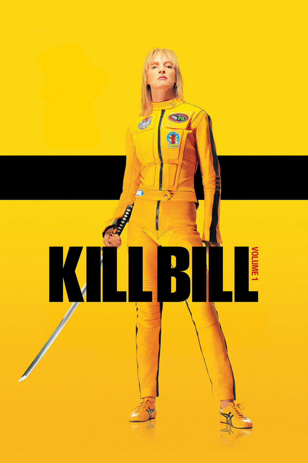
I think that the poster of Kill Bill Volume: 1 is a great example of impactful and essential use of color. This poster’s use of color dominates its design, the extremely vibrant yellow takes up almost the entirety of the poster contrasting heavily with its secondary color, pure black. This works so well for me as it mimics the subject of the poster, The Bride/Uma Thurman who wears a jumpsuit of the same design. And although it appears at first to be flat with just the two colors, dimensionality is created in the shadows, where on the jumpsuit the yellow turns to an orange, almost red in the shadows, the background fades into an orange as well. This boldness is representative of this character and this movie as a whole, creating a cohesive feeling of power and danger.
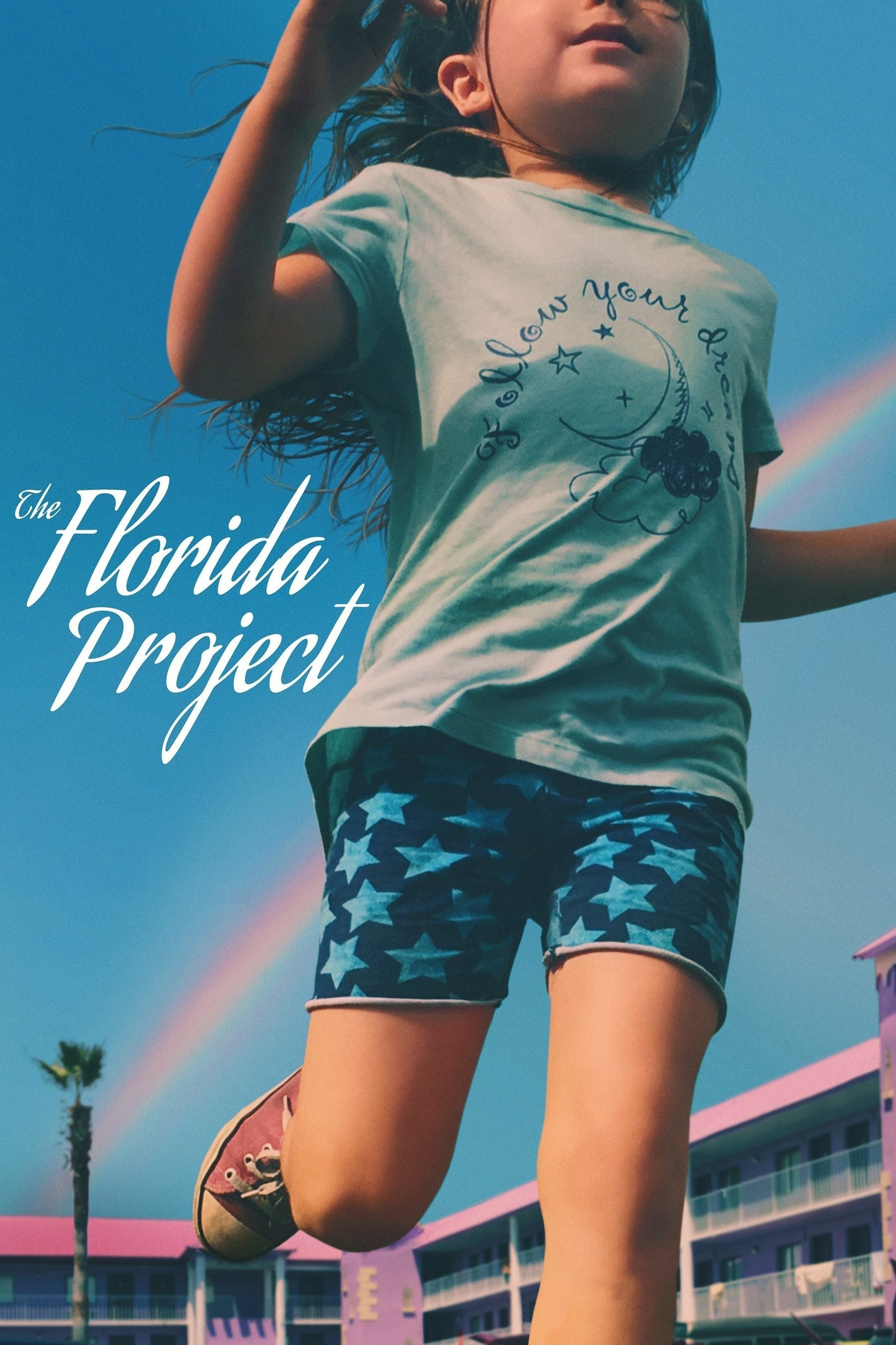
The poster of The Florida Project is another example of great use of color to convey a feeling and sort of identity of the film it’s representing, now through use of softer colors as opposed to bold ones. This movie tells a story of childhood innocence, of kids finding joy in everyday life, unaware of the harshness of the reality they live in, and the soft pastel colors of this poster reflect that. The colors themselves are childlike: light blues and pinks as well as a rainbow in the back. These colors could be bold but instead appear hazy and soft, and this balance of cool and warm tones create the feeling of a warm summer day to me, like reality but almost dreamlike and unreal, which makes this poster’s use of colors so essential.

Leave a comment