
The cover of The Lost World of Film Noir: Dark City by Eddie Muller is successful by presenting a graphic and title that catches the eye and is nice to look at while also being directly representative of its contents. I found this book in the Pace library, and although I have not read it, I have previously studied Film Noir. Film Noir is a genre of film that is categorized as dark, gritty, crime dramas, primarily from the 1940s-50s, characterized by cynical attitudes, complex plots, and dark, black and white, lighting and looks. This cover shows us just that as the entire thing is a black and white, tense scene of a man and woman in a car with a gun between them, capturing the essence of film noir in an image. The title strays from this genre in its bold color, which in itself I think is very successful in catching the eye from a distance and then inviting the eye in to look closer, but it also physically crosses the page and establishes itself as a title, the same way a title card in classic film noir would.
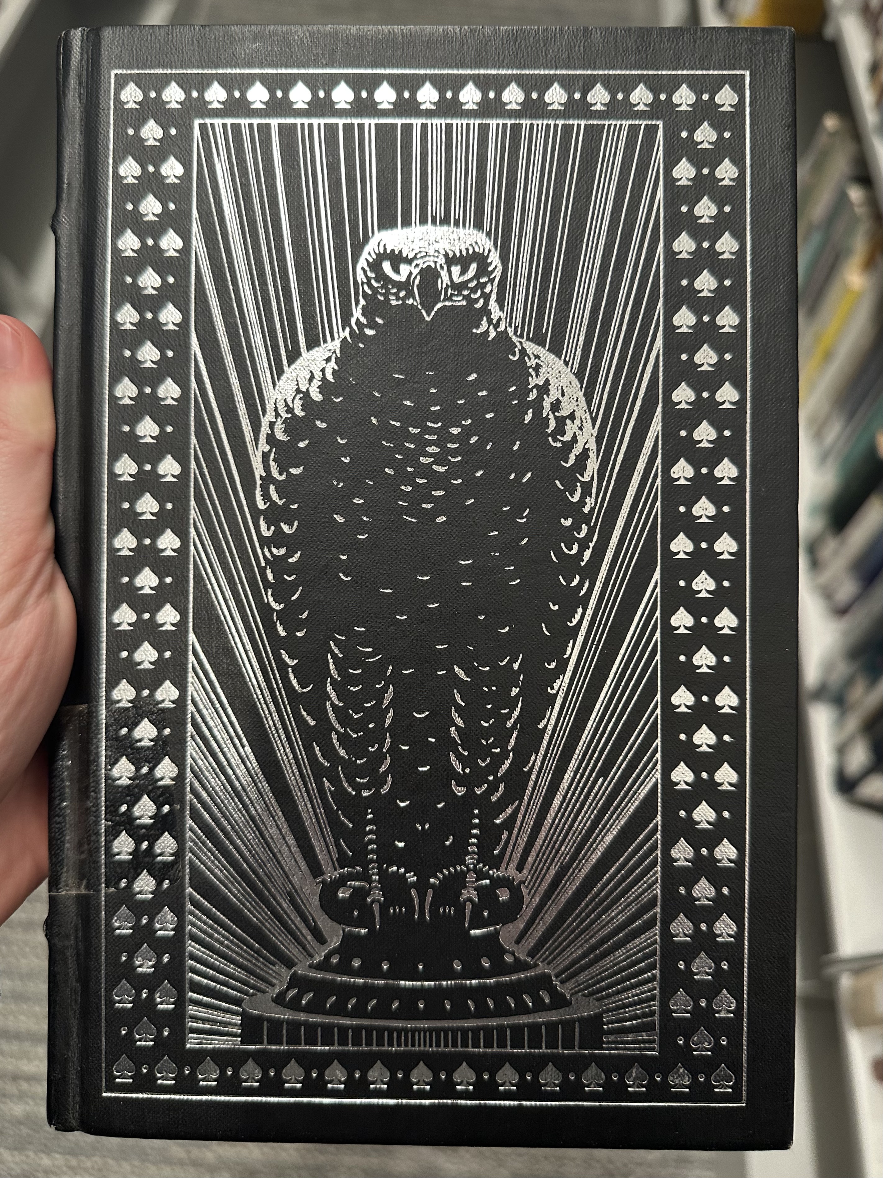
I have not read The Maltese Falcon by Dashiell Hammett, but I have seen and studied the film by John Huston based on the book, so I am familiar with its contents. I also found this book in the Pace library, and I wasn’t looking for anything specific at all, but I somehow found this sort of companion to Dark City, as it is a classic noir/film noir itself. This crime drama, in short, follows detective Sam Spade on the hunt for a highly valuable statue, the maltese falcon. This cover of this book then establishes this title without having to include any text at all on its cover by displaying the state with the same name as the title front and center, embellished in silver on black. This silver and black look complies with and is representative of the black and white, dark look and feel of noir. The falcon is also bordered with a pattern of spades, giving us our protagonist’s name, again without saying anything at all. Beyond this, the cover is just very elegant, being just embellished silver on black and without any words it sets a tone and creates an air of mystery, but also just feels expensive.
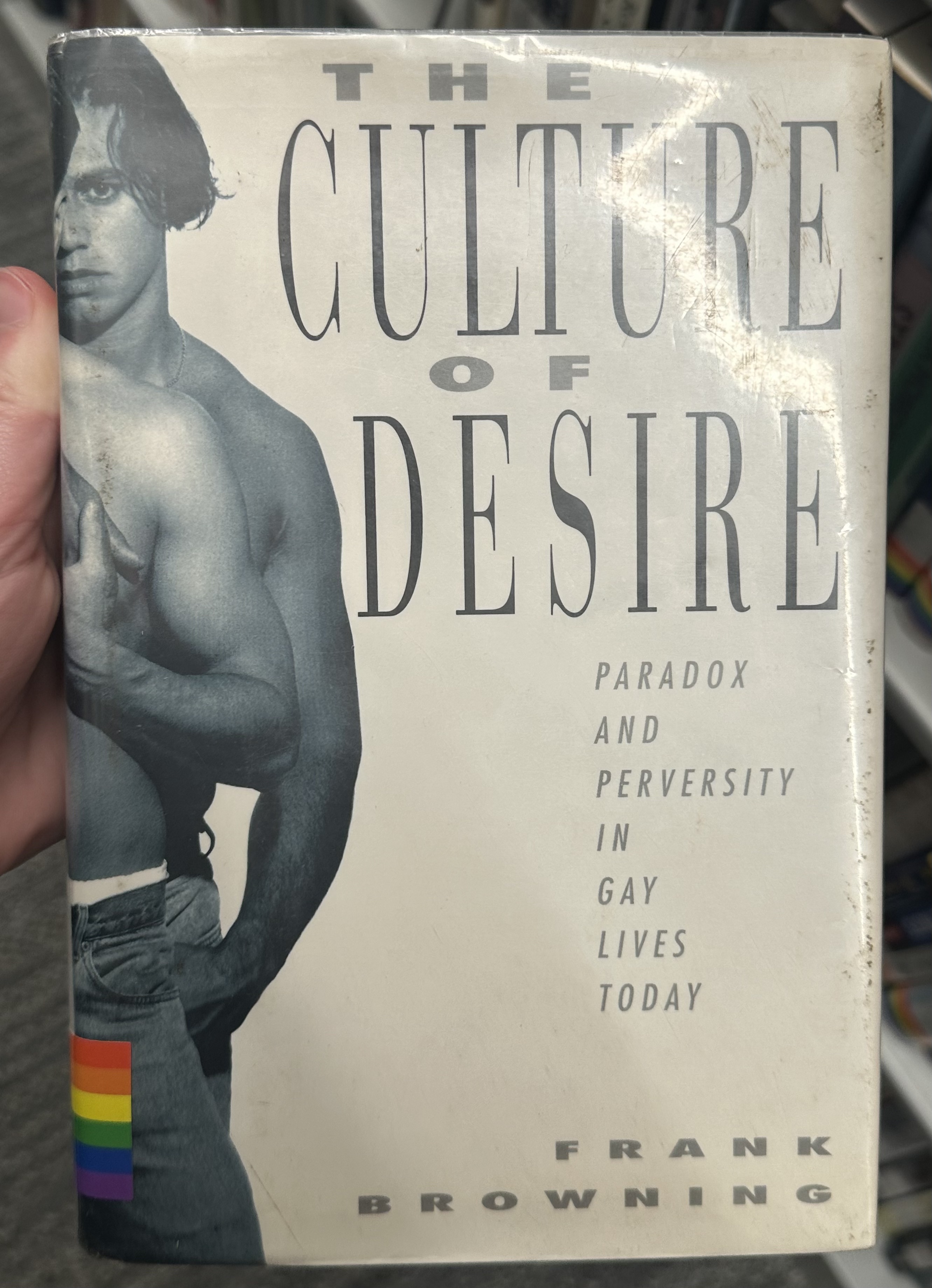
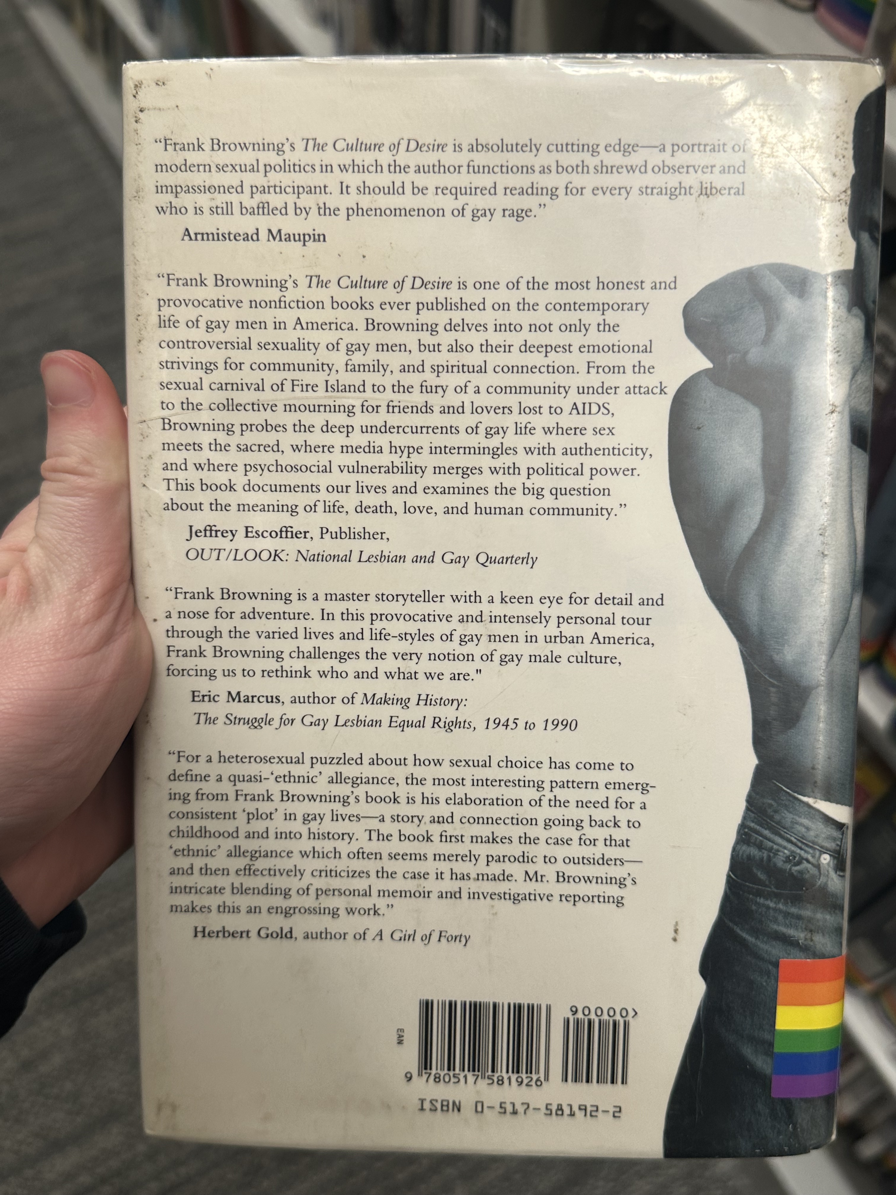
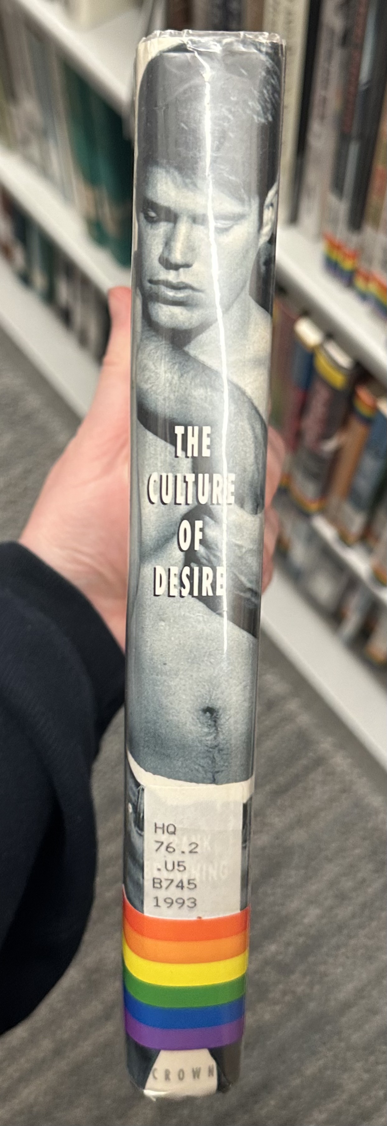
The last book cover that stood out to me, was also found in the Pace library and one that I have not read, nor is film noir, but is also entirely black and white and with that, still compelling in its look and execution. This book is The Culture of Desire: Paradox and Perversity in Gay Lives Today by Frank Browning. On a blank white background this cover features both image and text that work together on the page to relay information: the title is large and takes up most of the page but is also thin and does not eat into the white background or demand constant attention, I think it asserts itself but after that lets the graphic do the rest of the work. This is an image of two men embracing one another that begins on the front cover, but wraps around the side, creating a full working image background for the title to be displayed onto in profile, before continuing on to the back, where more information about the book is displayed to inform the reader of its contents and context further. The image works on its own in relation to the contents of the book, but works even further in guiding a potential reader into finding out more about the book, by following the contours of the men.


Leave a comment